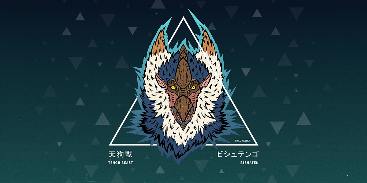
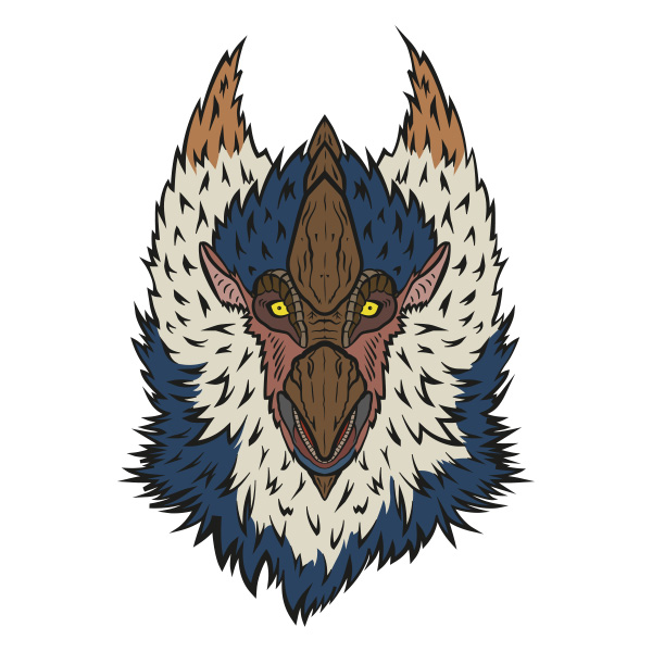
My Design Process: Bishaten from Monster Hunter Rise
As I recently posted my „Bishaten Monster Hunter Rise“ design on social media, I had some people reach out via Instagram, asking how I made this. (Let‘s be honest here, it was two people that asked, but that‘s NOT the point!) And as I started typing my response, I realised that my design process is more complicated as I first thought (and way too much to put into an Instagram PM). So I took some time over the weekend to reflect on how I approached this specific design and broke it down. If you always wanted to create something similar this might help you out tremendously.
Before we start
Research
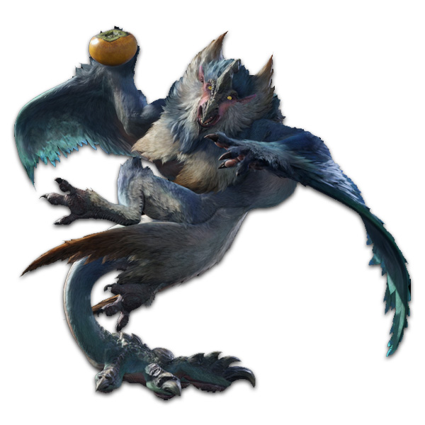
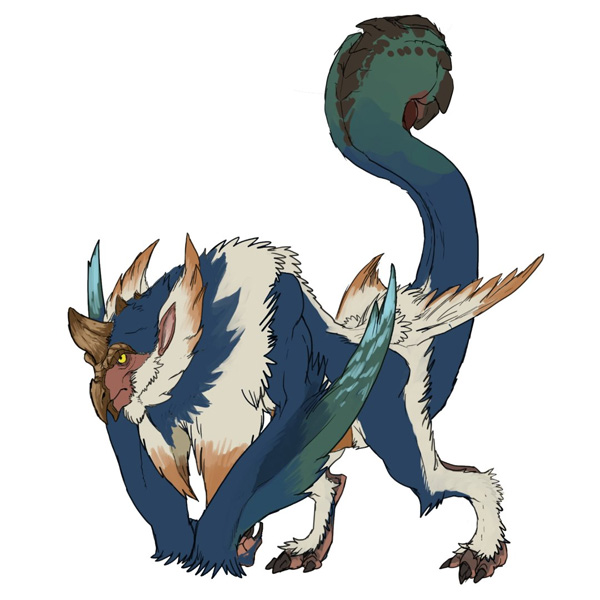
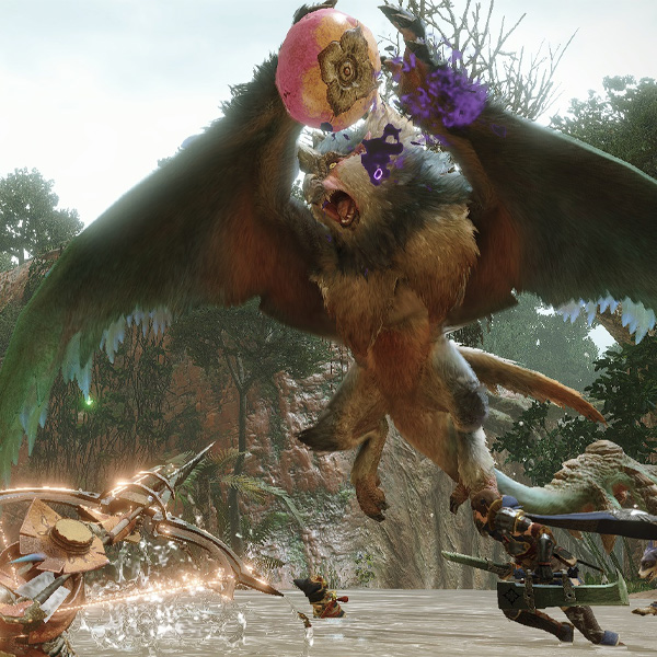
Before I put my pen (or mouse) down, I take some time to research the object that will become the key component of my design. In this example I googled „Monster Hunter Rise Bishaten“ (game name + monster name) and picked some pictures that I thought would help me in my creation process.
I was keeping an eye out for
1. an image that captures the expression of the monster well. This makes makes the sketching so much easier.
2. an image that is NOT a render of the monster but an icon or concept art. This is especially useful for finding the right colours and highlighting distinctive features of the monster.
3. an image (or video) of the monster in action. This helps me to get a feeling for the character of the monster.
Here are the images that I collected for my design. I simply saved them on my iPad to have references later on.
Concept
After the research, I start thinking about what I want to do with this design. I knew that I wanted a similar style to that I‘ve already used on my Goss Harag artwork. A pretty clean look, with some typography (in English and Japanese) and it should include a geometrical element that frames the monster in some way.
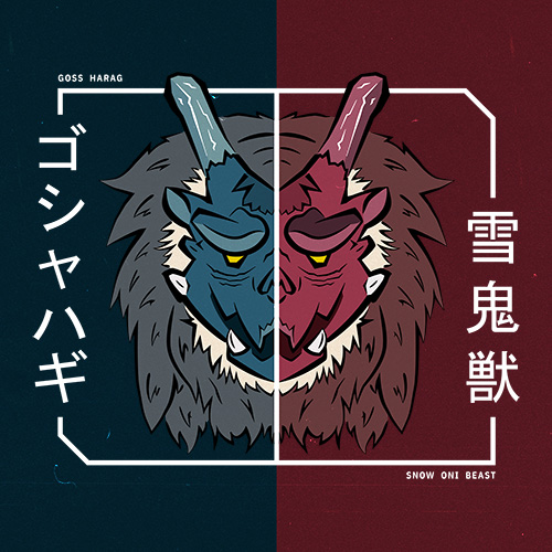
Because my Goss Harag design was quite „boxy“, I at first wanted to work with a circle for my geometrical element. As you can see, this didn‘t make the cut! I think it‘s pretty important to be open to the possibility that your concept might change at the very last step (at least that‘s what happenes to me a lot).
If you can’t come up with an idea yourself (and this is absolutely okay!) browse the web for a bit and get inspired by the wonderful work other people create. You will most likely come across something that catches your eye and want to implement.
IMPORTANT: Just don‘t outright steal work from others. Pick elements you like from one artist and others from a different one and combine them to make it your own. This way you grow as an artist / designer and don’t just rely on copying others. Put some thought into it. A bit of yourself.
The concept for my Bishaten Design was
1. A clean and stylised look for the monster‘s head
2. Some kind of geometric form
3. Typography displaying the name and title of the monster in English & Japanese
Tools
All right, last step before we get into the action: Think about what tools you want to use. There is a saying in German that reads:
“Das beste Werkzeug ist nur so gut, wie der Handwerker, der es benutzt.“
Which roughly translates to „Even the best tool is only as good as the craftsman using it.“ You don‘t have to use the tools that I recommend here. Use tools that you have more experience with. You can basically recreate something like this with a pen and paper (for the sketch) and any vector based graphic application.
The tools I used:
- Procreate on iPad (for the sketch)
- Adobe Illustrator (for tracing the sketch with vector paths)
- Adobe InDesign (for colouring and composition – which you could do in Illustrator as well)
- Adobe Photoshop (to add some grain to the design)
- Bonus: Any „Vintage Filter Apps“ as Instagram (for fine tuning the look & feel)
Creation Process
Sketch
This is the part of the process that I am most intimidated by. I am no artist. I have a hard time drawing what I come up with. BUT: with a litte bit of practice I got to a point where I can finally lay the ground work for some pretty dope designs, if I dare say so myself.
So: Hop into Procreate (or any drawing application you want), open up your references (the ones you collected in the „Research“ step) and start sketching!
And let‘s be real here: If you want tips on sketching, I am NOT the right person to ask for advise. But I can tell you what works for me and hey: Maybe (just maybe) if helps you out! Otherwise there are hundreds of sketching tutorials on YouTube.
What works for me
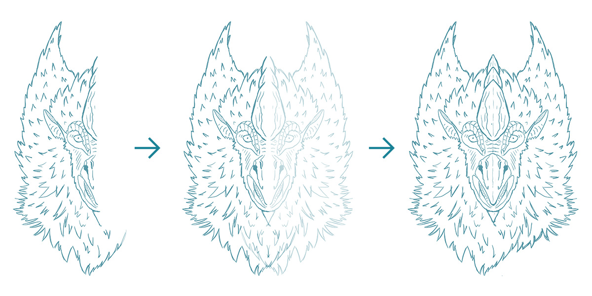
1. I only focus on one half of the face. I will simply duplicate and mirror the one half, so it looks somewhat like a complete face in the end. NOTE: This works pretty well for Monster Hunter monsters. Human faces? Probably not so much 😀
2. I start with the eye and work my way out from there. For me the little details are easier to sketch than starting with the outline of the face for some reason
3. I finish by framing the face with the outline. I use different elements (eyes, horns, mouth) as anchor points to figure out how much space needs to go between them and the outline.
4. If I am happy with one half of the face, I duplicate the layer and flip it horizontally. You should end up with somewhat of a good looking face (but sometimes I create an abomination and I start from scratch).
5. To wrap things up, I touch up some places I don‘t like and then export it to my Google Drive.
Keep in mind that this sketch doesn‘t need to be perfect. You can always adjust later on. But a passable looking sketch is a solid foundation for the next step.
Pathing
At this point the most stressful part is done (at least for me). So I boot up Illustrator, create a new workspace (I always make it 300x300mm) and start by importing my sketch (simply dragging and dropping will do).
I will then lock the layer my sketch is on and create a new layer ABOVE it. This way I will have my sketch fixed in the background and it won‘t move, no matter what I do.
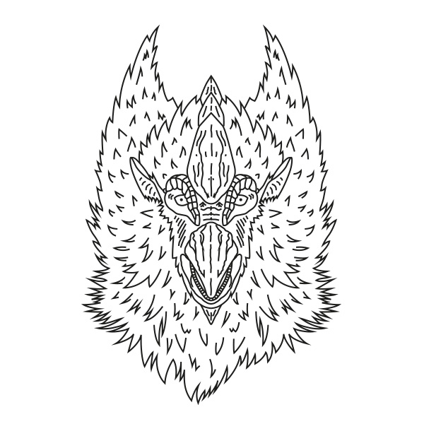
And then I start pathing. I use the „Pen Tool“ (P) and make sure that all my lines are black and have the same width. This will look somewhat stupid at first but don‘t worry. We‘ll add more dynamics in the next step. When you are finished, your work should look something like this:
So, what do we do to make those lines look less LAME? We simply use something called the „Width Tool“ (Shift + W). With it you can change the width of your lines and create some awesome looking strokes! Just select the tool from your toolbar, click and hold onto a path and drag your cursor. Your path will get wider (or slimmer) and you can make as many adjustments to your paths as you like. From here it‘s basically testing what looks cool! Personally I really like to make those pointy parts wider. Creates a really bold look.
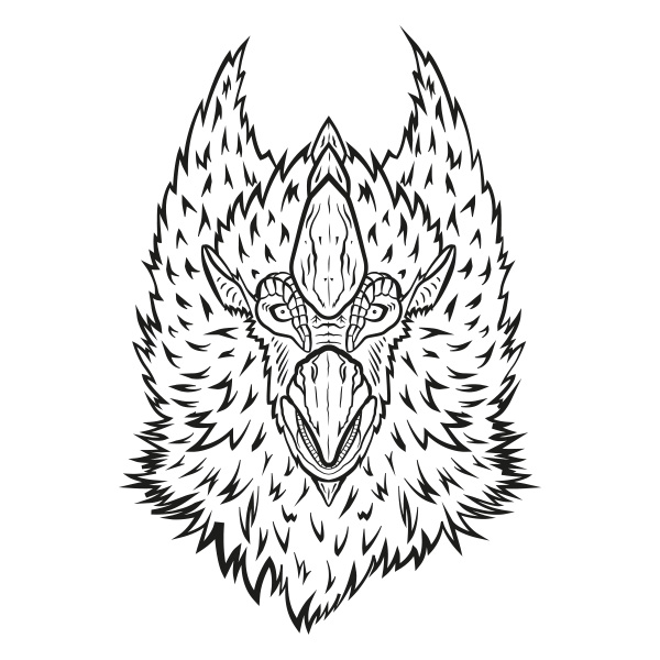
Some thoughts that might help you
1. Don‘t use TOO many different widths. This might look busy and we don‘t want that in our (relatively) clean design.
2. Make sure to highlight the most important elements by making them a bit thicker than the rest. The horns and beak in my design are somewhat wider than the rest.
3. The outline of your design should be wide enough to make clear „This is where the monster‘s face ends“. In my case the bottom part of my outline is pretty thick, but at the top it stays quite lean. This was a conscious decision because the bottom was already pretty busy and I wanted something for the design to „rest“ on. At the top there is less going on and so I decided to turn it down a notch.
If you are happy with your lines, duplicate the layer you were working on (just in case you want to come back and change it later) and hide one of the two layers (by clicking the „Eye“ symbol next to the layer). Select all paths on the visible layer and go to „Object > Path > Outline Stroke“. This will turn your paths into forms (which makes it way easier to continue working with).
Bam! You got the outlines of your monster’s face!
Colours
This is where I will copy my outlines to InDesign. You don‘t need to do this if you are comfortable working in Illustrator, but it makes some things easier for me.
We will now add some colour to this bad boy. And basically all I do in this step, is to fill the spaces between our outlines! This can be done by simply importing the image you researched for the colours of the monster (YOU DID THAT, RIGHT?) to your workspace, selecting the “Eyedropper Tool“ and picking the required colours straight from the image.
You should get about 5 – 10 different colours this way (depending on how detailed the image is) that you can now use to fill in the spaces! In my experience this is one of the most fun and rewarding steps, because you finally see how your work comes together.
After I am done with that I will step away from the screen and come back about an hour later and look at it again. And 99% of the times I will then adjust some of the colours manually (because they don‘t pop enough) and throw out colours that are too similar to each other.
I like to have about 3 – 4 „main“ colours (aka the most dominant ones) and 3 – 5 „supporting“ ones (for smaller details e.g. the eyes the mouth and so on). This way our design distinguishes itself even more from a drawing. Oh yeah, and I MOSTLY pass on using any gradients at all. These come into play in the composition step!
Composition
Now that the key element of our design is done, we need to wrap it inside other elements to create something that people would (hopefully) hang on their walls or (let‘s be real) put on their home screens).
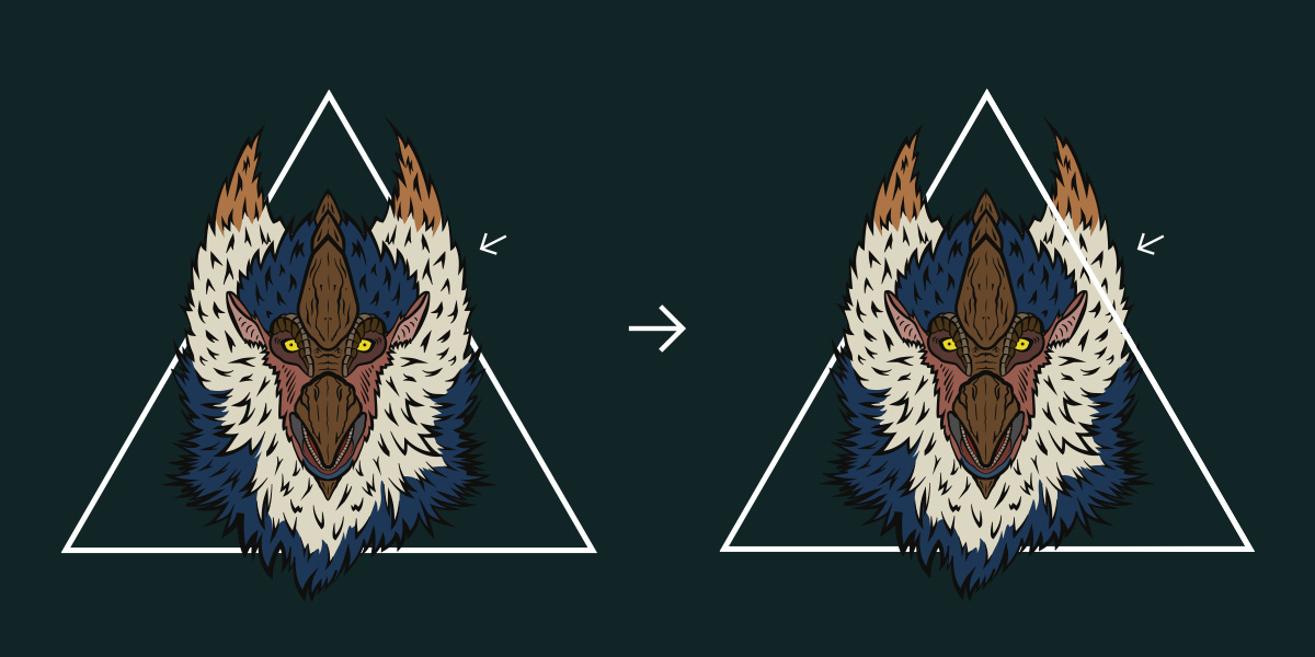
Geometry
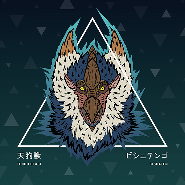
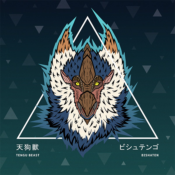
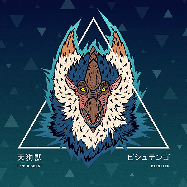
Remember when I said that my first idea was to combine the face of the monster with some kind of circle? Yeah. I tried it and it did‘t really work out. The face was too pointy, too rough. So I went with the most pointy geometrical form there is: A triangle!
But just putting it behind or above the monster‘s face was still not enough. So I went for something that (at first) I thought would „break“ the design but turned out quite nicely: three-dimensionality. By overlapping just one side of the triangle, we create somewhat of a 3D effect. And honestly? It‘s probably one of my favourite parts in this design. I goofed around a couple of minutes till I was satisfied with the outcome.
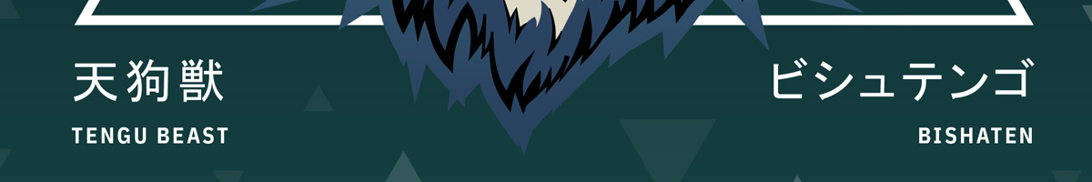
Typography
This step was probably the easiest. I knew, what I wanted the text to read:
- The name of the monster: Bishaten – ビシュテンゴ
- The title of the monster: Tengu Beast – 天狗獣
At this point I need to give the biggest shoutout to Gaijinhunter, an incredible Monster Hunter content creator, for checking my Japanese spelling! If you are a Monster Hunter fan and haven‘t checked him out yet: Close this post right now, go to his YouTube channel and show him some love! And then maybe come back here.
Because I wanted my design to stay pretty clean, I chose fonts that would add to it and not distract. I tried going for some Japanese ink brush fonts (also the idea of Gaijin) but it somewhat didn‘t fit the picture. It was too much.
The fonts I used
1. English text: IBM Plex Sans Condensed – Bold
2. Japanese text: MS Gothic – Regular
The emphasis of Monster Hunter Rise lays in it‘s Japanese roots. And because of that I wanted the Katakana and Kaji to be more dominant than the Englisch text. I aligned them left and right to the bottom line of the triangle and made the English text a bit smaller than the Japanese.
Background
Basically all important elements are done at this point. And if I was to go for only a shirt design, I would probably stop here. But because I created this design mainly with social media in mind (to express my unhealthy excitement for Monster Hunter Rise), we need to add a background that compliments the rest of the design.
I started by creating a dark blue gradient (dark blue at the top and a little lighter blue at the bottom). Try to make this gradient REALLY dark. We don‘t want the background colours to compete with the ones from the monster’s face. It should be clear that the face is the main focus and the background is simply there to create some kind of space around it.
The gradient alone didn‘t do it for me tho. So I went with MORE TRIANGLES! Basically all I did was:
- create a white triangle
- duplicate the triangle a couple of times
- rotate about half of the triangles by 180°
- space them out
- create a smaller triangle
- repeat steps 2 – 6 one more time
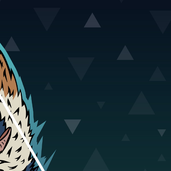
What I did end up with is 3 different sizes of triangles dotted across my background. Additionally I decreased their opacity by a LOT. Otherwise they would have been too dominant. Then I started handpicking some of them and turned their opacity up again (or even further down) to create a sense of depth. I wanted that some of them seemed closer than others.
If you are done with that: Congratulations! You are basically done. Export your artwork (I suggest PNG so the neat details won’t get lost in JPG compression) and post it online to flex to all your friends!
But… there are two more things I like to do:
Grain & Filters
This step is completely optional, but I want my designs to have a bit of texture to them. So the first thing I do when I am satisfied with what I have done so far, is to import my design into Photoshop and add a Grain Image on top of it. (You can find tons of free ones by googling “Grain Texture free”.) Then I mess around with the „Blending Options“ until I like the outcome. I want the grain to be noticeable but at the same time not too dominant. This gives it a more authentic look.
But I don‘t stop there (although maybe I should, but this is mY DESIGN AND I CAN DO WHAT I WANT!). I boot up Instagram on my phone and spend way too much time applying different filter to my artwork, until I find something that resonates with me. Maybe this seems like a unnecessary step, but I almost anyways like the outcome more than the one without it. Try it yourself! You might be surprised!

Closing Thoughts
And with that we are finished! I usually just post my designs on my Twitter and Instagram, so the file I get from the Instagram export is absolutely sufficient.
Thank you everyone who followed all the way through and I really hope I could give the two people who wanted to know, how I create my designs an insight to my process. It might look like a lot, but as soon as you get down the different steps, it only gets easier from there.
Most importantly: This is not the ONLY way to do this. My process changed a lot over the last couple of years. My biggest „Level Ups“ were when I started implementing GOOD research and sketching into my workflow.
Also: working with foreign languages is dangerous! Always make sure that some native speaker, or someone that uses this language on a daily basis, assures you that what you have written is correct. There are so many horror stories out there in which someone used a slur just because they didn‘t know any better. (Thanks again to Gaijin for helping me out here!)

Marius Silvester Kauer
Aka TheChewer
I’m a graphic designer living and working in Munich, Germany. When I’m not pushing pixels, I’m out exploring worlds in various video games. Sometimes I combine these two things. That’s when I create the stuff you will find here! Stay a while and listen.